Watercolor Illustration
tips for precise watercolor-ing

The essential tools for creating watercolors are simple: paint, brushes, and paper. That being said, because there are so few variables, it is imperative that the quality of your supplies is matched to what you plan to make.
For the absolute beginner, you can get started with a cheaper paper, a set of watercolors, and two brushes which will all probably come to about $100 depending on which paper you choose and where you buy your supplies. I link below to two different watercolor sets, one in dry pan form and one in tube form. There’s no real difference between them; I personally like working with pans because they’re easier to use outside and travel with but the tubes are easier to mix with.
Beginner watercolor shopping list (opens new tabs on BLICK):
1. Canson watercolor pad (budget option) OR professional grade paper
2. set of 18 colors in pans OR a set of 12 colors in tubes
3. Size 2 Long-Round velvet touch link on blick
4. Size 6 Long-rouch velvet touch link on blick
As you progress and begin doing highly detailed work, I find that I’d rather skimp on the quality of the brushes and the pigment but that using the highest quality paper is absolutely crucial.
For highly detailed work, your paper must be hot press, pure cotton, and no less than 90lb weight (140 lb/300 gsm weight is best). I personally use arches but hahnemuhle and fabriano make excellent papers, as I’m sure do other suppliers that I haven’t tried yet.
To blot my paintbrushes as I work, and also to blot out mistakes, I prefer to use the highest quality paper towels, those of the ‘shop towel’ variety. High quality kleenex also work well, as do non-synthetic soft rags. Cheap paper towels will only damage your paper, let you down and discourage you.
Pad of 9x12 Arches Watercolor paper link on blick
Size 2 Long-Round velvet touch link on blick
Size 6 Long-rouch velvet touch link on blick

Color Palette
A palette is highly personal. If you are not sure yet what subject matter you'll gravitate towards, a simple primary palette is more than sufficient.
Watercolor sold in tube form is excellent and can be easier to mix with; if you plan to be doing all of your work at a table/indoors I recommend tubes. Personally I prefer to use pan watercolors because I find them easier to use in the field. I keep my pans in a tin box and customize my palette based on what I'll be painting so that it is easily transportable.
When you find your preferred subject matter,I recommend that your palette match your chosen subject matter to minimize the amount of color mixing you have to do. The colors you use most often depend on the subject matter that you are drawn to. For example, if you plan to paint mostly flowers and fruits it is helpful to have multiple bright, saturated colors on hand. If you are more interested in painting mammals it is handy to have a more saturated palette.
My basic palette consists of:
-indigo
-violet
-cyan blue or prussian blue
-French ultramarine blue
-Lemon yellow
-cadmium yellow
-vermillion
-primary or quinacrodine magenta
The following colors are helpful for painting the colorful parts of flowers/fruits:
-viridian
-pthalolite green
-opera
-quinacrodine purple
-transparent gold
The green parts of plants:
-hooker green light
-olive green
-forest green
-cinerous blue
-turquoise
If you plan to paint animals or duller subject matter such as stones/bones/wood, the following colors can be very helpful:
-yellow ochre
-burnt sienna
-warm sepia
-paynes gray
-alizarin crimson


General Tips
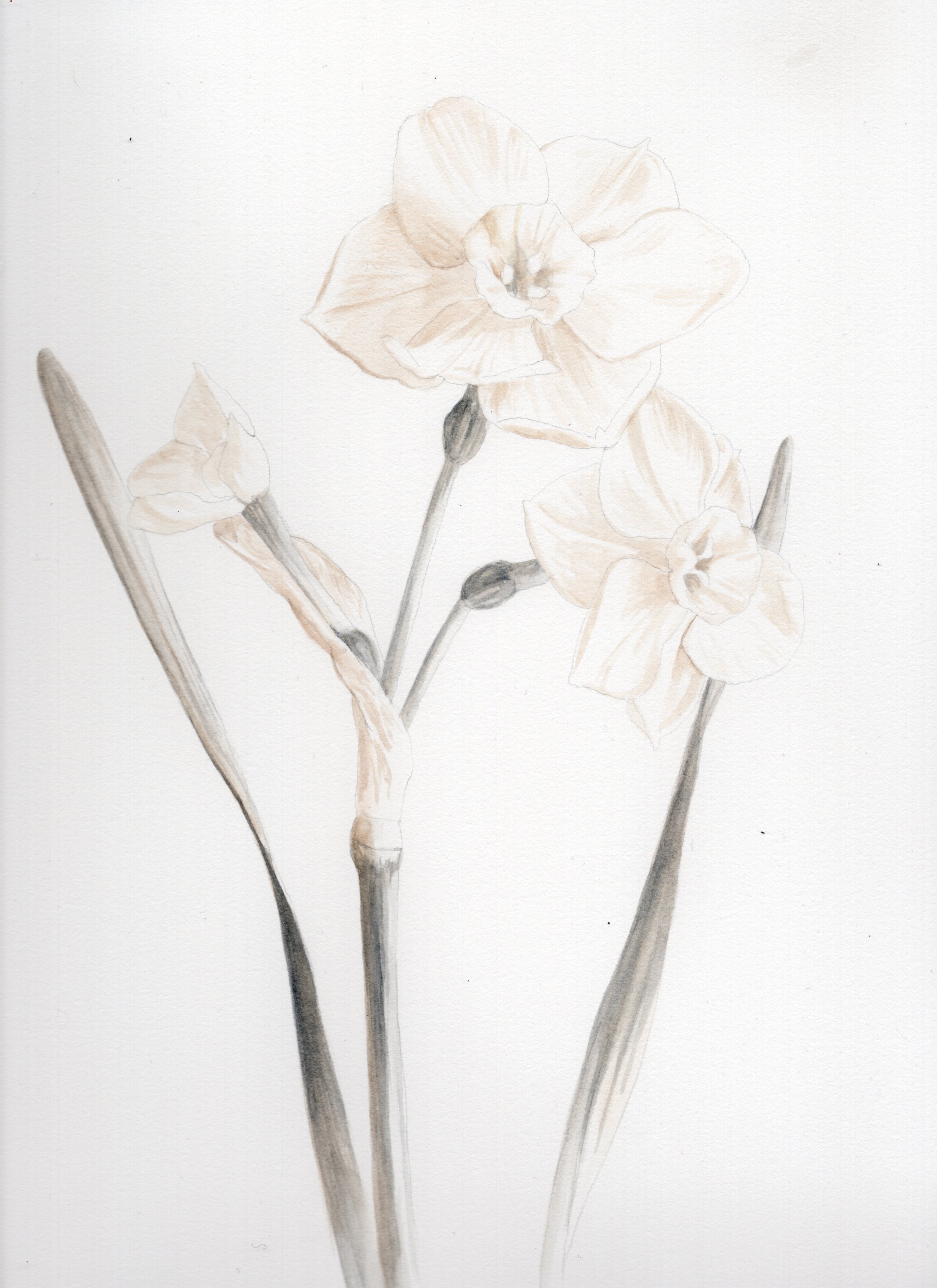
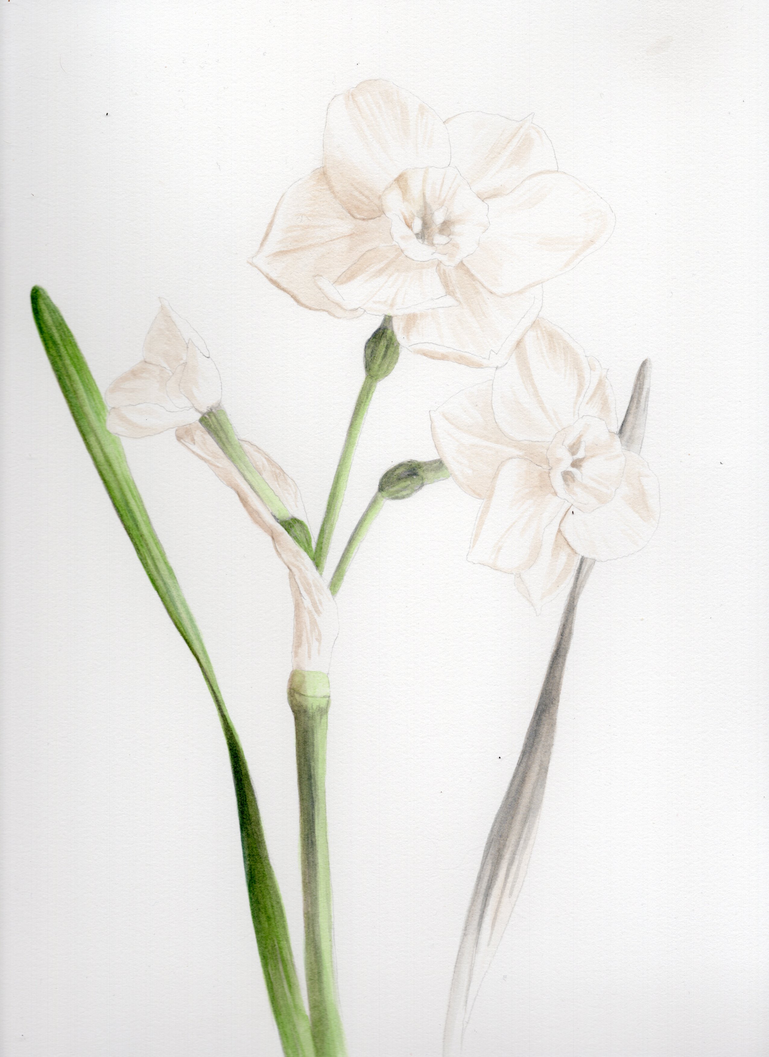
Much like you would begin an oil painting, I tend to begin with an underpainting that establishes value and then layer color washes on top to achieve full color. Although you can use any pre-mixed dark to underpaint with, I recommend mixing your own shadow mix with the red/blue/yellow of your choice to match the tone of your subject matter. I find that for most plant subjects ultramarine blue/cadmium yellow/alizarin crimson make a nice shadow hue for my underpainting. Depending on how warm or cool the subject matter is, I’ll tilt my shadow mix to suit.
When working with subjects that overall very much one color (like a green leaf or a brown dog) it might make most sense to do your underpainting all in a drab variant of the color that dominates; for example, a leaf might be underpainted in olive green or a dog in burnt umber. Payne’s gray and indigo also make for great underpainting shades depending on your subject matter.
Here are a few stages of a daffodil painting with a shadow mix of ultramarine blue/cadmium yellow/alizarin crimson


One of my favorite books on the subject is “Painting Plant Portraits” published in 1997. You can typically find used copies of it for under $10. The same author’s other publication is an excellent technical guide to drawing botanicals, both listed below:
-Painting Plant Portraits: A step by step guide by Keith West. ISBN-10 : 0881923729 ISBN-13 : 978-0881923728-How to Draw Plants: The techniques of botanical illustration by Keith West. ISBN-10 : 0881923508 ISBN-13 : 978-0881923506
This book, published in association with Kew Gardens, is an excellent resource for learning historical techniques:
-The Botanical Artist: Learn to Draw and Paint Flowers in the Style of Pierre-Joseph Redouté ISBN-10 : 1839406801 ISBN-13 : 978-1839406805
For a collection of excellent historical examples, with high quality reproductions, I recommend:
-An Illustrated Catalog of American Fruits and Nuts ISBN-10 : 1733622047 ISBN-13 : 978-1733622042